Progress is being made on the master bedroom addition at Carlton Landing. The drywall went in this weekend, followed by flooring later this week. All but one of the windows is installed and we’re still on track to wrap this thing up in July.
I thought I’d show you some of my inspiration for the space as well as the actual pieces that are going into the bedroom and bathroom. We’re hoping to get the house back into the rental market in August, so I’ve been working on getting everything ordered up ASAP. I think the headboard should be in within a couple weeks. The HVAC also went in this past week and in a fortuitous move they discovered that not only was the existing AC unit blowing cold air into the crawl space under the house, but there were a few other issues happening too. So thankfully those are all rectified now. GAHHH.
THE INSPIRATION
I really hemmed and hawed about the fabric and colors for the bedroom. Overall the interior of the house is painted primarily in Benjamin Moore’s Decorator White and I’ve used a spectrum of blue and chambray throughout (see the One Room Challenge reveal and Rue Magazine tour). I wanted to honor that color foundation, but also have a little bit of fun with it. The master bedroom should feel distinctly individual, but still connected to the rest of the house’s flow. And while it would’ve been really easy and obvious to do the headboard in navy or chambray blue (which I thought about here), it just felt … boring.
I kept coming back to this image that I shot in the Rowe showroom during High Point. Every time I walked through this particular room, I felt so happy! The colors all felt so fresh and clean, and that pop of bright coral red on the headboard was the perfect counterpoint to the chambray bedskirt (unseen in this particular photo, but you get the idea). It could be a totally overwhelming color for a bedroom, but with all the white linens, white walls, and natural wood accents, somehow it feels like the perfect focal point.

GET THE LOOK: POP OF COLOR MASTER BEDROOM
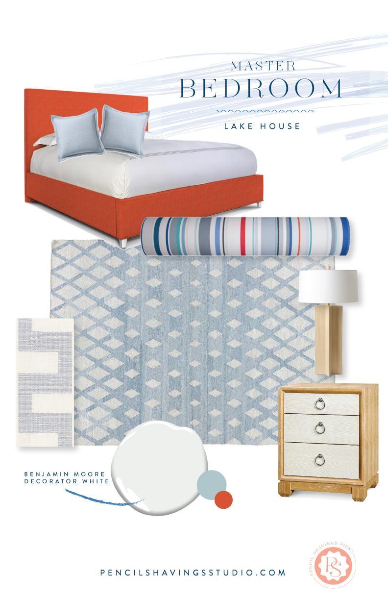
Can I tell you a secret? I was majorly nervous to pull the trigger on that custom bed from Rowe. ME. The COLOR QUEEN AFRAID?! But the more I thought about it, the more it felt like the right decision. It’ll be an amazing statement (and even though I’ve shown it as a complete bed in the roundup below, it’ll actually just be the headboard only). On the floor is an indoor/outdoor Jaipur rug in a faded chambray and the floors will be wood to match the rest of the house.
I’m having white drapes done in Crypton’s linen and I’m doing that Schumacher trim on the leading edge for some pizzazz. The other windows in the bedroom are white linen roman shades.
The stripe fabric is some from Les Toiles du Soleil that I’ve been hoarding for a couple years for just the right project and this is absolutely it. I’m having it made into a large custom bolster the width of the queen size bed. I CAN’T WAIT!!!
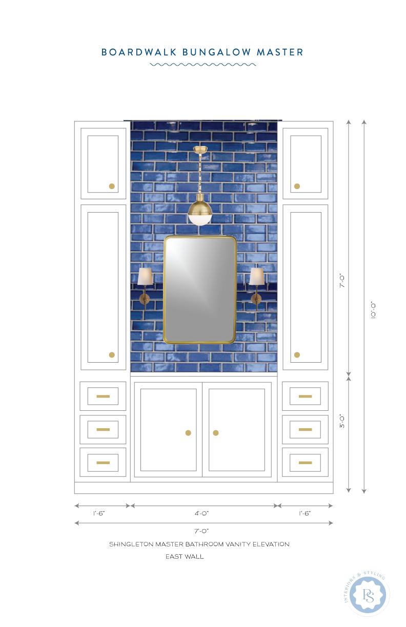
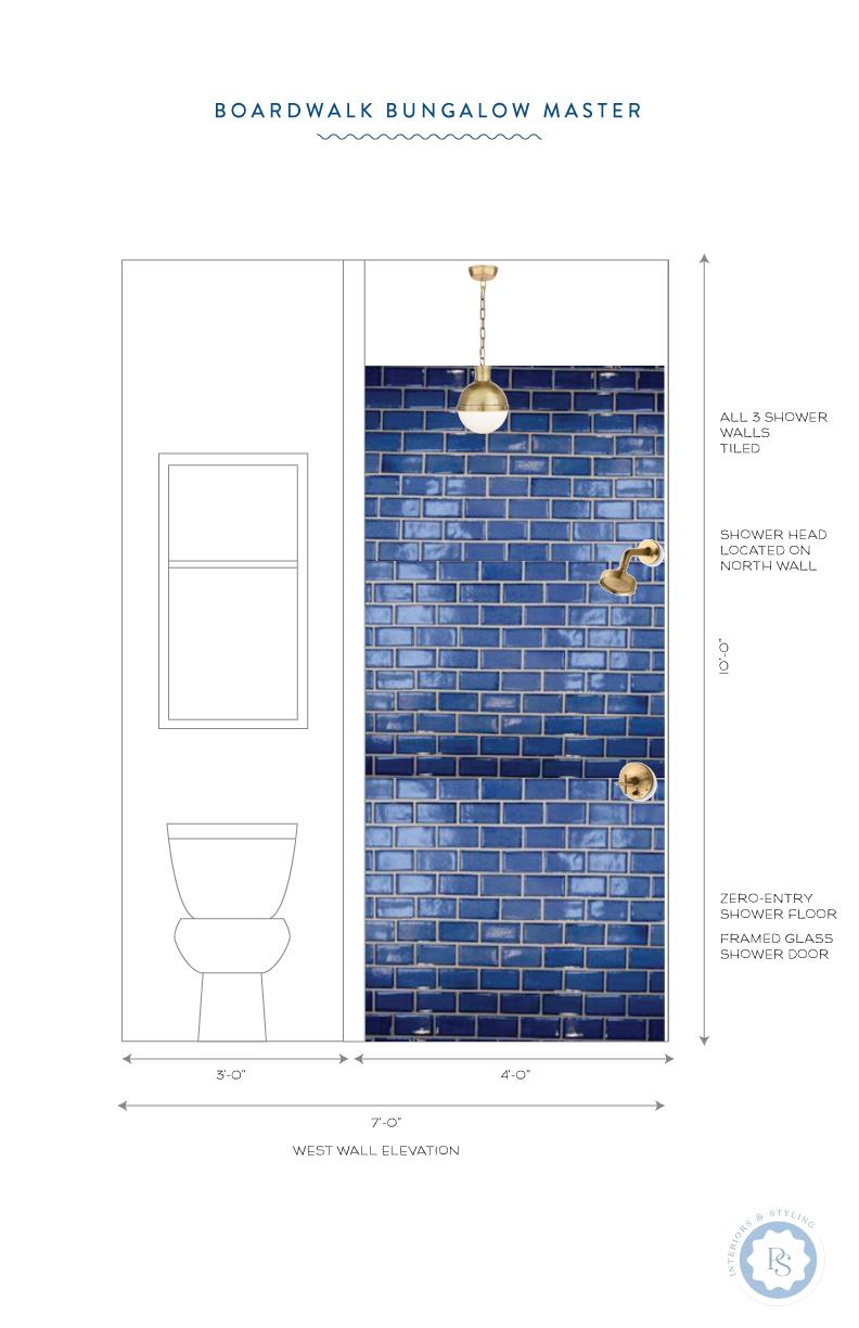
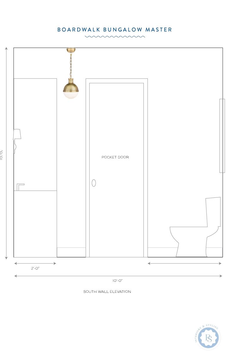
GET THE LOOK: POP OF COLOR MASTER BATH
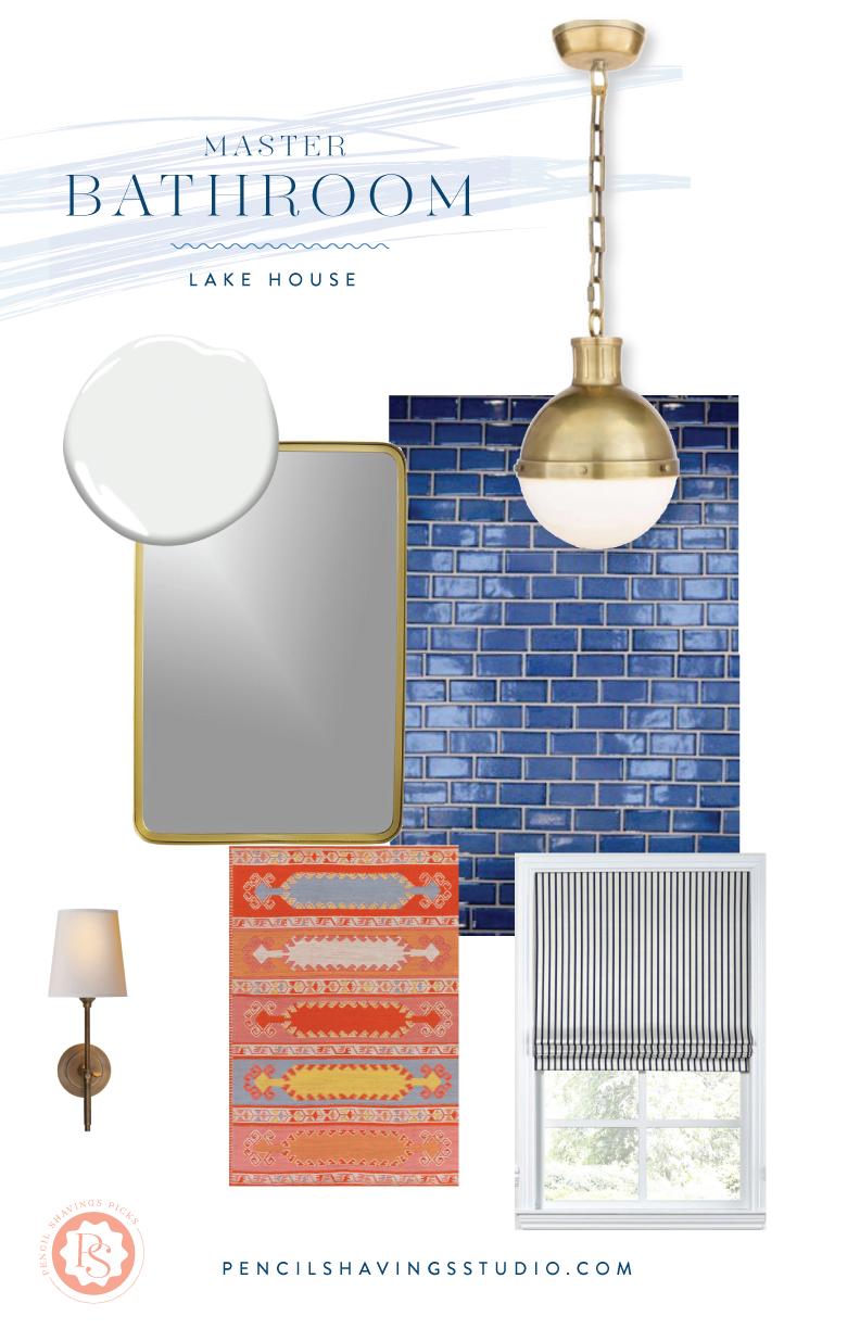
In the bathroom, this is where things are really going to get fun.
Mercury Mosaics reached out to me about potentially partnering up on a tile project and I was like DO I HAVE A PROJECT FOR YOU, MY FRIEND! YES YES YES!
I’ve had this dream of doing something with long skinny subway tiles BUT I wanted them to feel a little less perfect in that typical subway style. And more handmade. Mercury has these stunning handmade ceramic tiles that are exactly what I was looking for — I wanted to honor the existing style of the current bathrooms in the house (small black hex tiles on the floor, white subway tiles on the wall) but just a smidge more interesting.
The wall behind the vanity will be done in a bright sapphire blue tile as well as the entire shower. And for the floors, we’ll do a hex tile. I cannot wait to see this thing come together. It’s going to be stunning.