With my One Room Challenge for Fall 2017 ending up being rather, shall we say, large I figured I’d better break up the reveal into two posts. Up first is Jude’s room and attached playroom-turned-hangout space. (Come back tomorrow for the upstairs living room reveal. I promise it’s worth it!)
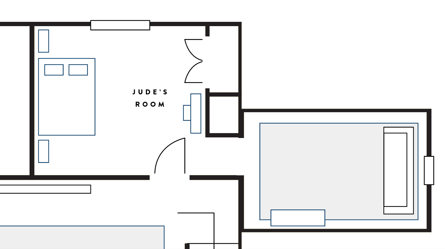
For a reminder, here’s the floorplan and you can see the before shots here.
THE BEDROOM
I am so pleased with how everything has turned out. It feels much more grown up, but still really flexible in style so that it will grow with him through adolescence. And most of all, Jude is thrilled. HE LOVES how everything turned out.
There were a few concessions I had to make because, after all, it’s not really my room, is it? The first thing we (erm, I) compromised on was getting a bunk bed. I personally didn’t see the necessity of it since the boys don’t share a room, but he was deadset on it. And you know, I get it – I remember wanting a bunk bed too when I was a kid. Plus we don’t have a guest bedroom, so it is kind of nice to know that we’ve got an extra bed in the house in case we needed it.
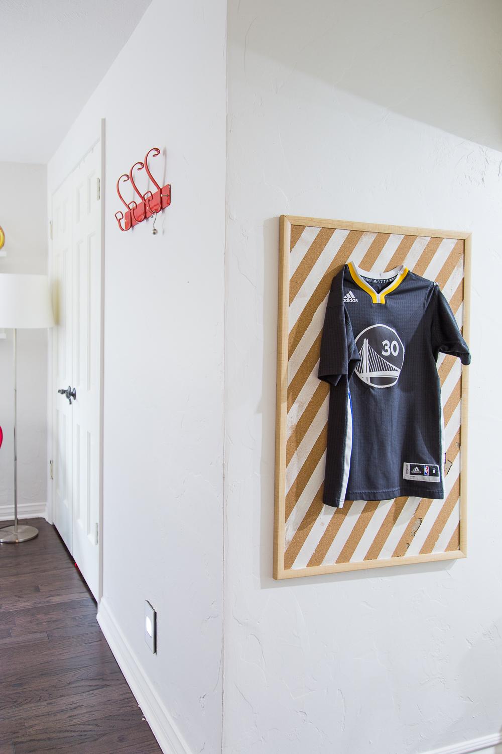
Here’s one of the jerseys I framed. I painted a basic corkboard from Target, and I got so irritated because when I pulled the painter’s tape up, a lot of the cork came up with it. #DIYfail So I ended up only painting the one board. I haven’t decided if I’ll do another one. I couldn’t figure out why some of the cork came up but only in patches.
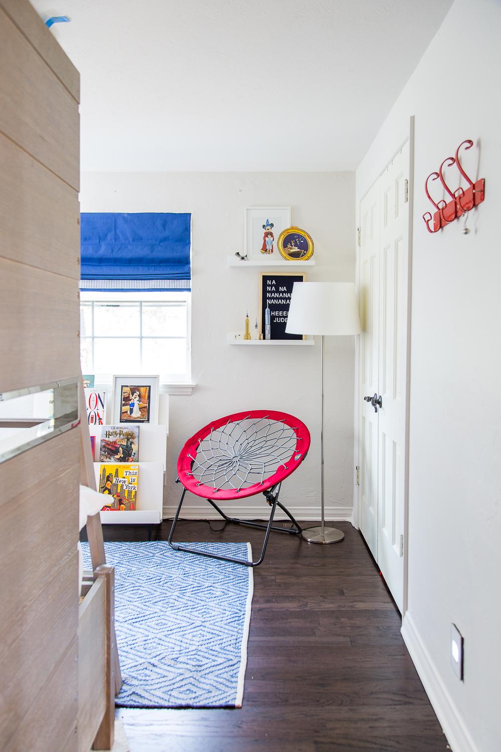
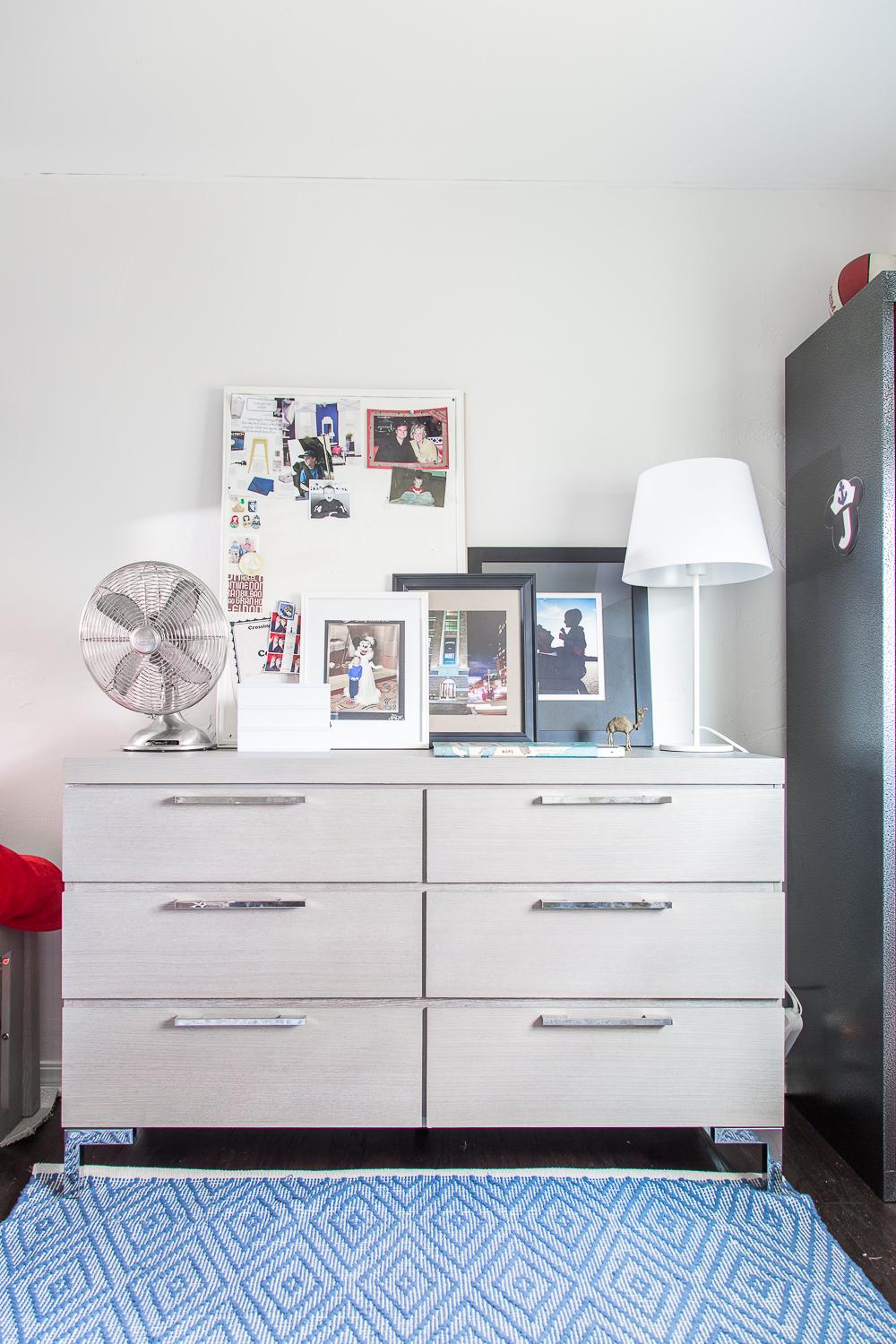
In the main bedroom area, I’ve kept the bunk beds and his dresser near the closet. That way we don’t have clothes getting flung hither and yon as for awhile there I had the dresser in his hang out room. But it made better sense all together. We also kinda wrestled about the arrangement of everything. I like that in this particular layout he gets to have a lot of open floor space and he was also dead set on having his much-beloved OU locker featured prominently.
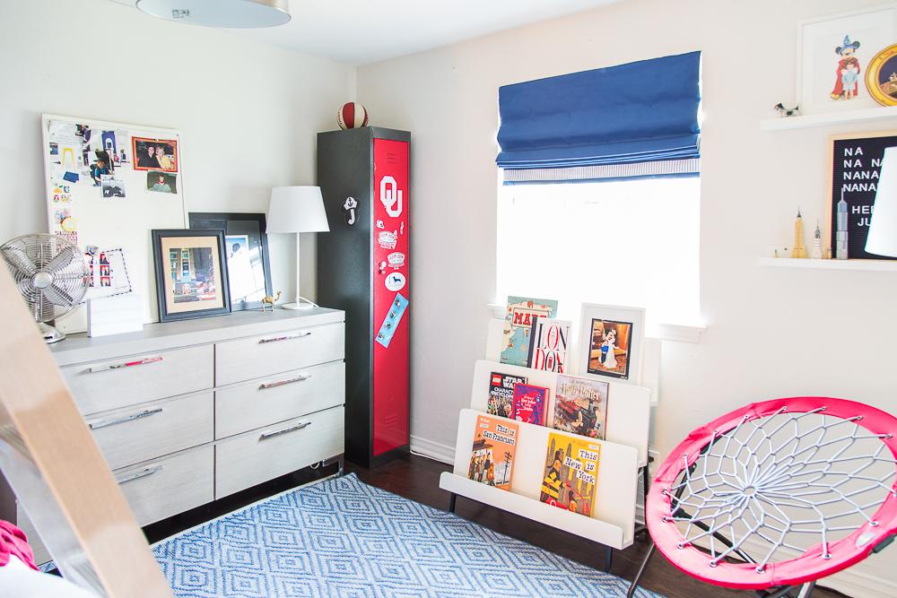
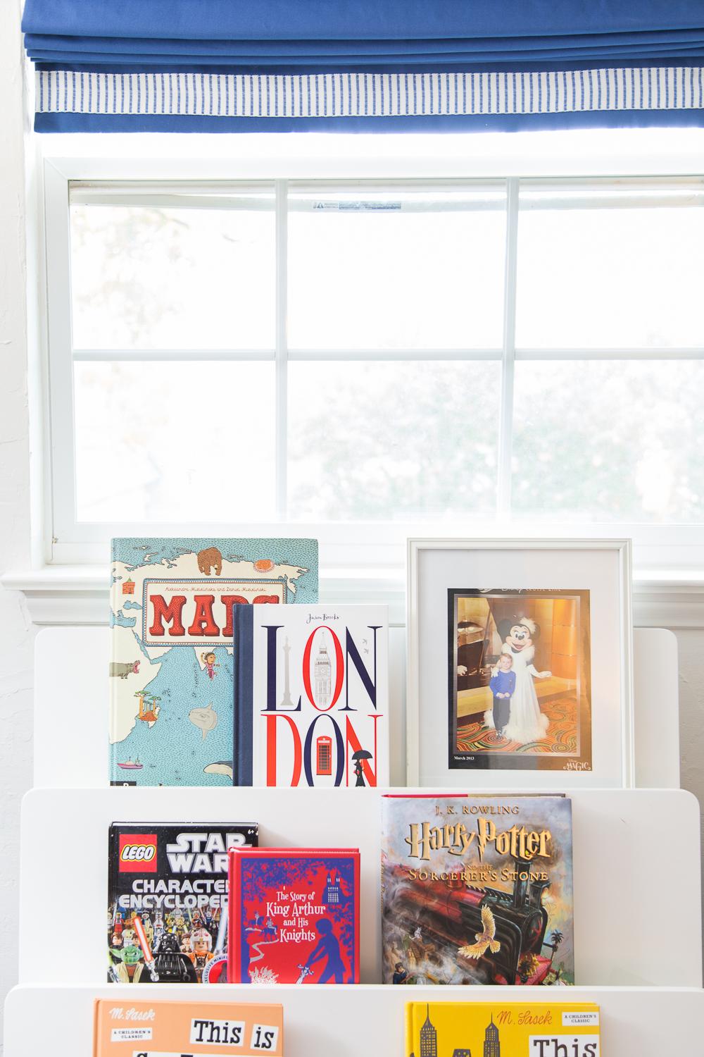
A detail shot of the lovely custom roman shades from Grace Allen Design with the striped Schumacher trim that echoes the Serena & Lily bedding we chose. Library bookshelf from Land of Nod a few years ago.
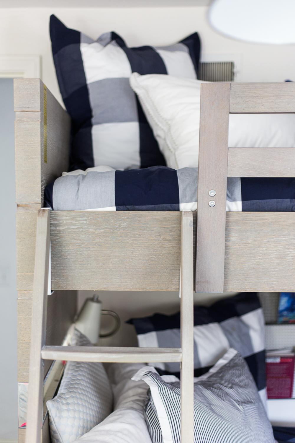
The bunk bed is the Axis style from Universal Furniture’s Smart Stuff line. We went with the twin-over-full size design, and also did the custom-fit storage cubby underneath, which is my favorite part as it looks so much more polished and complete like that. You could also do a trundle bed if you’re so inclined. I love how modern and clean it is, and the metallic accents add a lot of style to it. One of the best parts of this whole makeover is how much more storage we have since I cleaned out the closet, and – it isn’t a super glamorous component, but the function of it is everything.
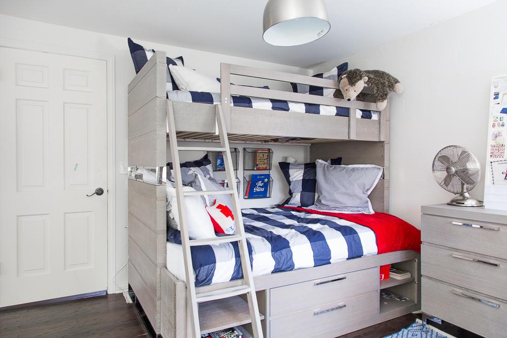
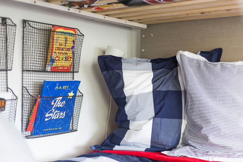
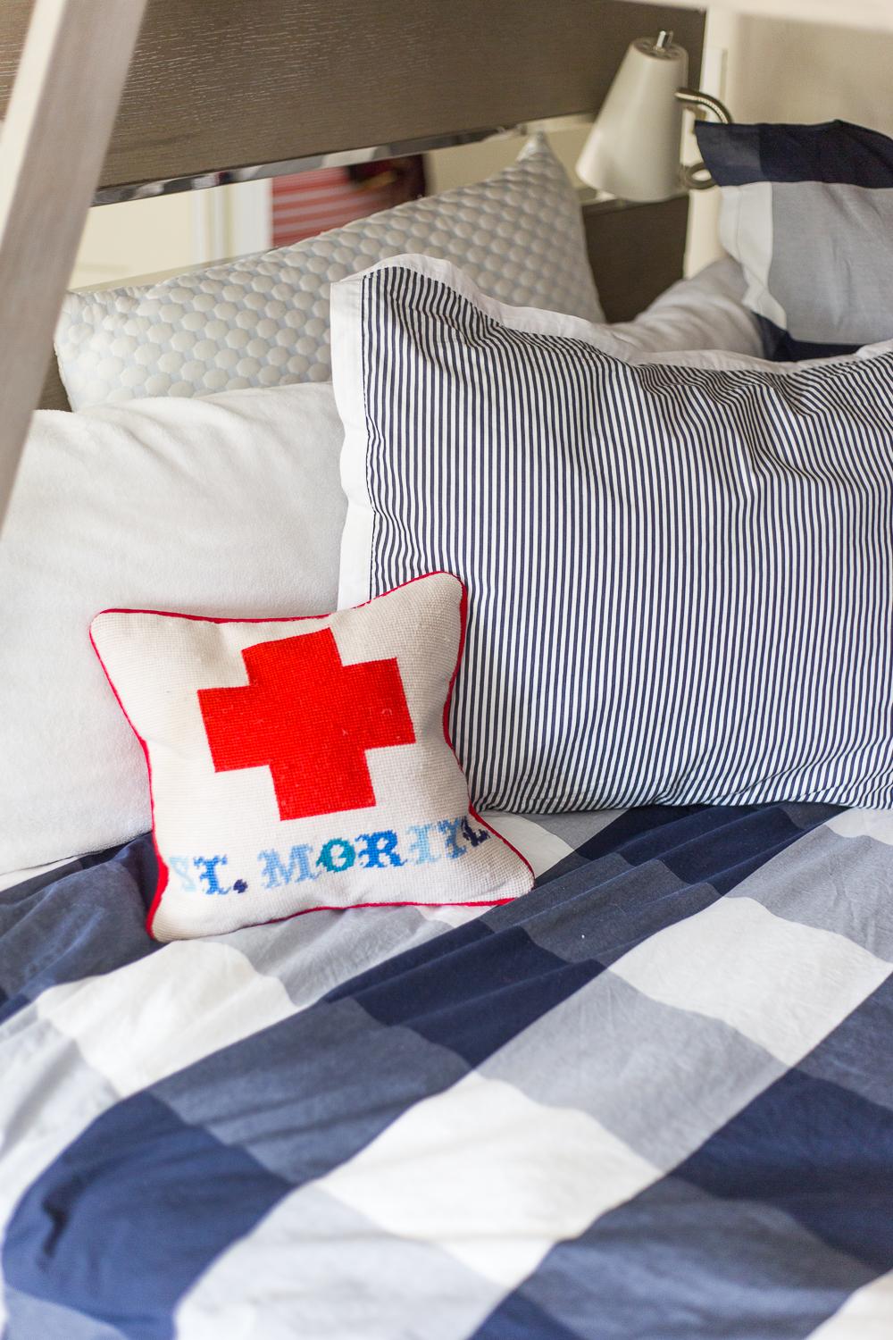
The bedding from Serena & Lily gets to be the visual star of the show. A bright blue gingham is a great contrast with all the clean modern lines. I paired it with a red throw blanket and some Oxford stripe shams.

The rug is from my super secret eBay source and was a steal at $45.

Smart Stuff Furniture is especially impressive to me because of the safety component. It’s designed for kids, and with all the news of little ones pulling heavy furniture over on themselves, Universal came up with a way to keep that from happening by installing a one-open-drawer-at-a-time safety system. Overall, everything we have from Smart Stuff feels heavy and really well made. It isn’t going to fall apart anytime soon. And the silver feet on that dresser make my heart go pitter patter.
THE HANGOUT ROOM
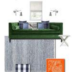
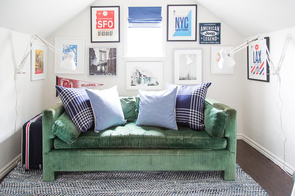
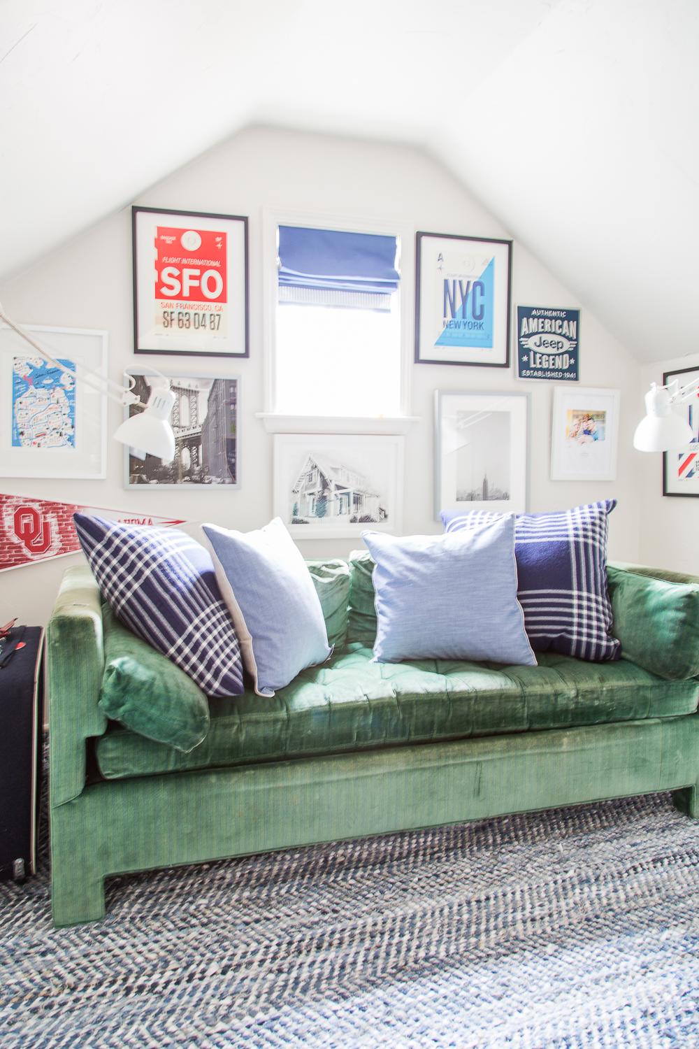
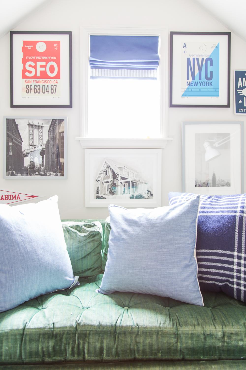
Ok, on to the playroom-turned hangout room. This is where we really got to have some fun. I envisioned this being such a great place for us to read and hang out after school, and it’s become just that. He does his homework in here and every night we love curling up on my Dad’s vintage sofa and reading a few chapters of whatever book he’s into at the moment. Plus I love the way the ceilings slope downwards; it’s just a magical room, plain and simple. It’s the kind of space I would have adored as a kid (so Anne of Green Gables or something!). But for Jude, I wanted to provide a place filled with images of his favorite places and memories. I pulled in suggested artwork from Minted and a few other sources featuring shots from San Francisco and New York and he picked out his favorites. BOOM. Made it happen. And right in the center is an illustration Simon commissioned our friend Chris Castro to create of our house at Carlton Landing for me for Christmas a few years ago. Kind of felt appropriate, right?
Anyway, it’s a happy and eclectic gallery wall full of graphic pieces and classic photography. I hope he thinks of all our happy memories on those trips when he looks at it (I definitely do!).
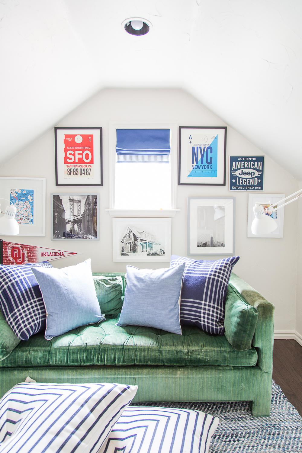
Serena & Lily sent the most beautiful denim and suede rag rug. I love the texture it provides and it’s got a great feeling underfoot. I knew it’d be stunning with that vintage emerald green velvet. We already had the Serena & Lily floor pillows for our patio, but now that it’s winter I brought them inside so we could continue using them. It’s not an enormous room – the 8×10 rug takes up almost the entire space, but those do a great job of being kind of like a coffee table. Chambray pillows and a great pair of masculine wool plaid pillows complete the look and provide that grown-up polish.
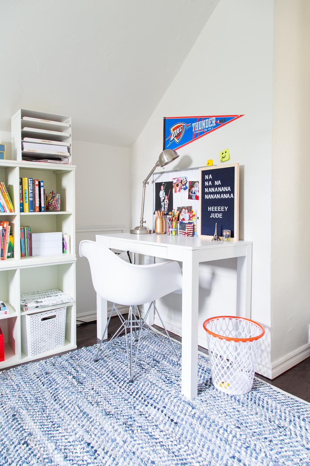
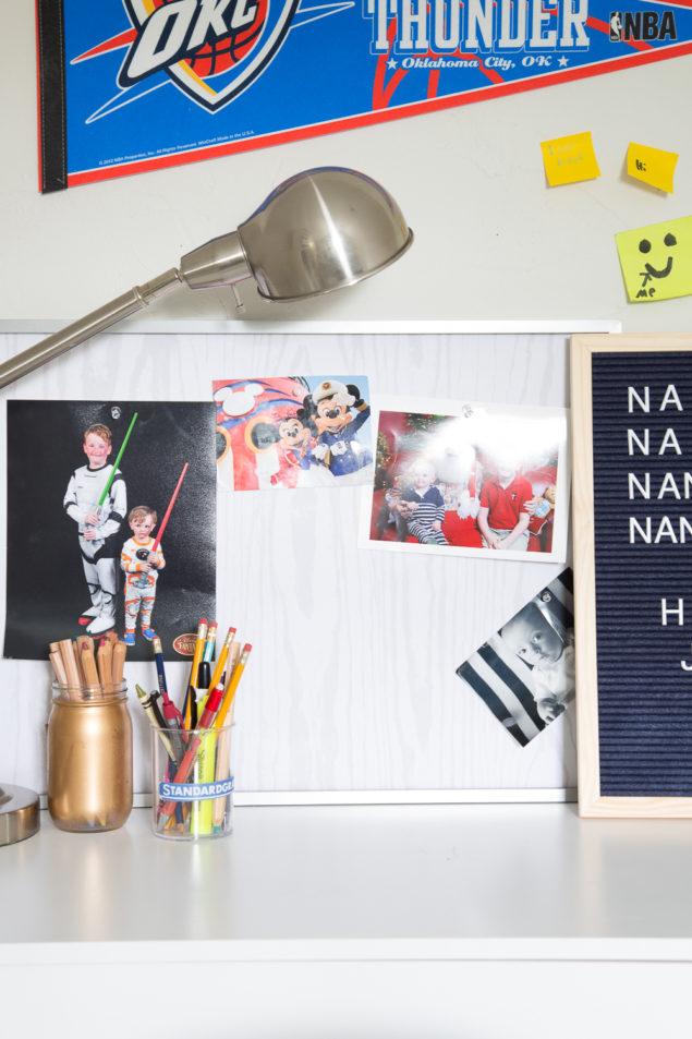
In the corner Jude’s got his own little Parson’s desk setup complete with plenty of art supplies and post-it notes, per his request, and a custom pinboard from Minted for his miscellaneous bits of ephemera and OU football tickets. I didn’t have a ton of money to spend on the desk, and it was an Amazon find for $55. Be warned – it’s so cheaply made that it makes IKEA look fancy. The eames knockoff chair was from a few years back.
A closeup of the custom pinboard. Love the faux bois fabric.
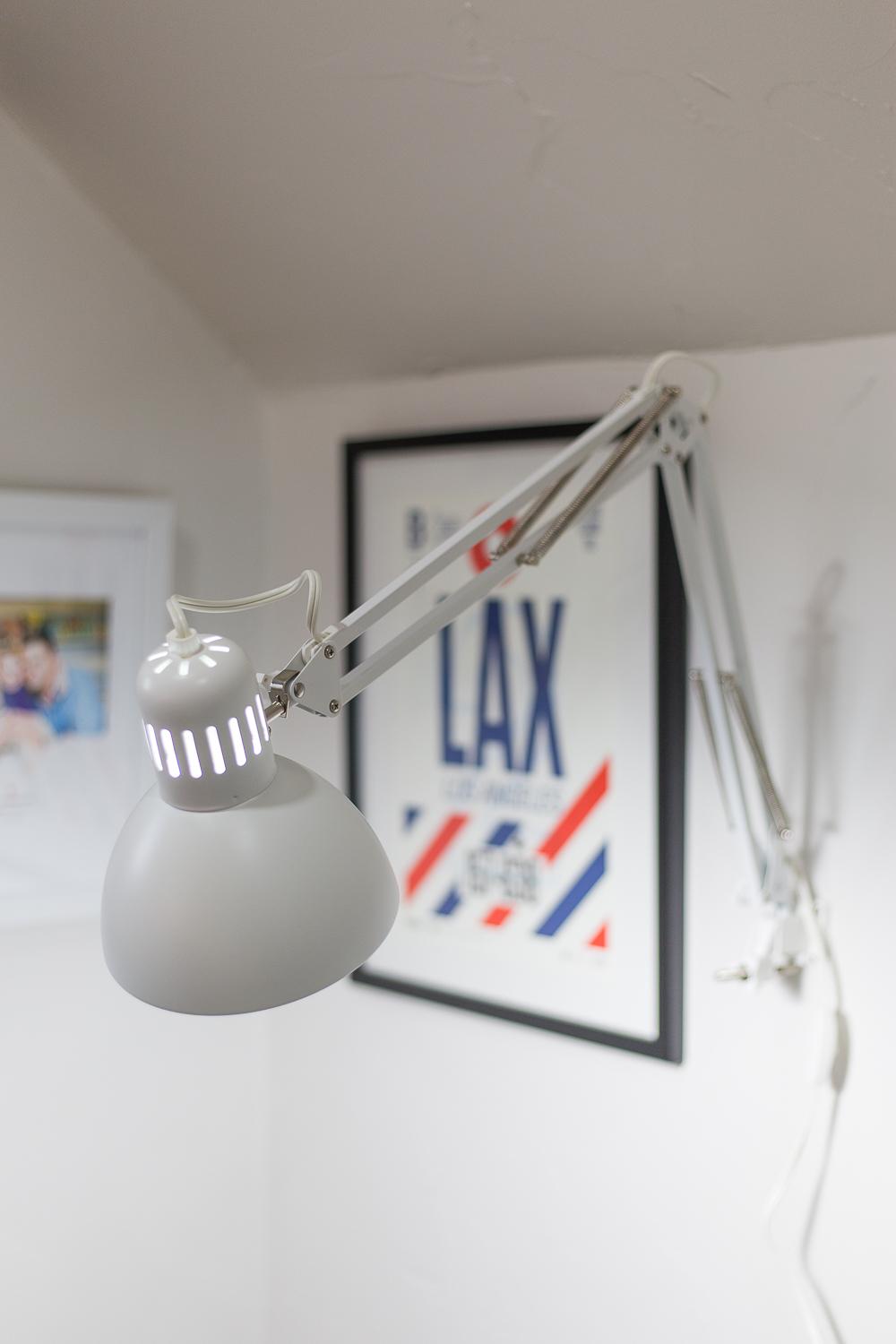
Then last weekend, I bought a pair of these clamp lamps from IKEA and they were a STEAL at $10 apiece. I saw them wall-mounted in one of the IKEA showrooms, and I thought hmm. That could be an interesting small space solution. So I bought them and installed them on either side of the sofa in lieu of a table or floor lamp. I couldn’t be happier with how easy they are to move, and they aren’t wobbly at all.

I do still need to adjust the cords and get them under control.

Love this shot of one of the bridges in Manhattan with the Empire State Building perfectly framed underneath.

Ok, that does it for the first part of this fall One Room Challenge reveal. Come back tomorrow for part 2!
SPONSORED BY
The One Room Challenge comes together very quickly, but it wouldn’t be possible without some major help from these fantastic sponsors. Thanks for supporting these brands that I love!
Universal Furniture // Stroheim // Serena & Lily // ME Home Collection // Highland Hardware // Grace Allen Design // Minted // Nourison
And thanks to Linda at Calling It Home for hosting and also to House Beautiful, the media sponsor.