
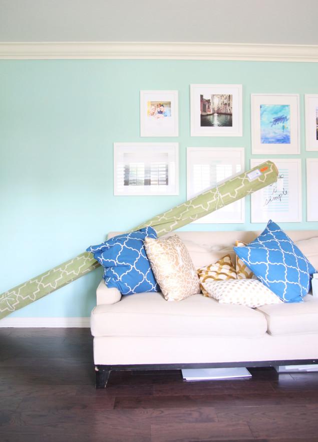
I’m finally getting the house pulled back together after having the Pergo hardwood floors laid a few weeks back. I am loving the finished look and everything feels so crisp and clean with the dark wood floors as the base. Dark wood can pair up with practically any color scheme. It plays well with white as well as pastels (including my aqua living room, above), but it can add extra depth and drama when paired with rich fall & holiday-inspired jewel tones. So let’s take a little colorful tour of some pretty spectacular spaces to get you inspired for your last-minute holiday decorating updates. And you might spot an overall theme to these looks to glam it up a bit (spoiler alert: lacquer!).

I’m seeing a lot of saturated color lately and a few weeks ago when we were in LA, we popped into Grace Home Furnishings who always has the chicest showroom. Their front two rooms were coated in the most gorgeous emerald wall treatment that felt so fresh and perfect for fall. This look would be easy to recreate with dark flooring (see how pretty that buffet looks?), gold hardware, and peacock blue accents. Right up my alley and insanely chic. Green was starting to feel a little overplayed there for awhile, but this perked me up instantly.
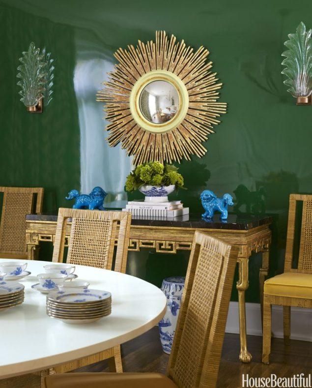
And then I stumbled on this dining room below after seeing Grace’s incarnation, and it really nails the whole fall vibe with a lot of luxury thanks to all the lacquer, gold, and natural accents. Deliciously high-end, isn’t it? That lacquer is insane.
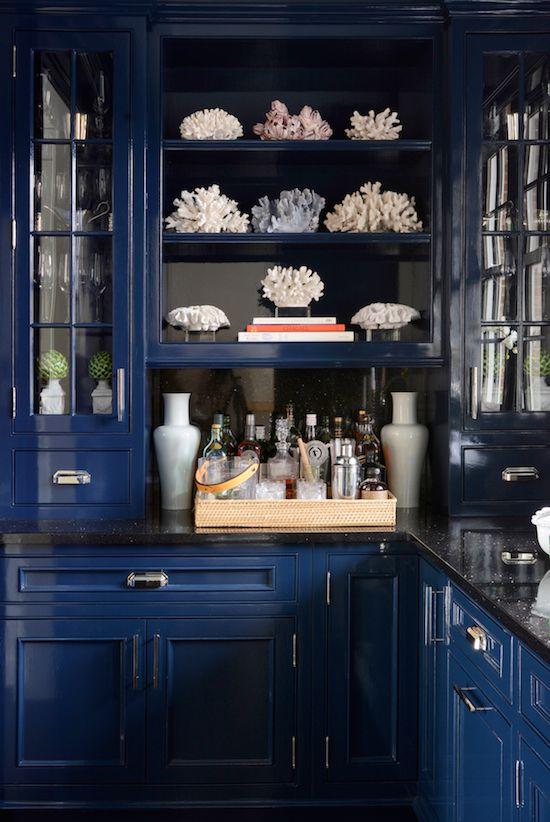
Blogger friend Sue de Chiara of The Zhush has quite possibly the most highly covetable butler’s pantry I’ve ever seen. Any room would feel rich and enveloping painted this fab sapphire color, especially a small space.
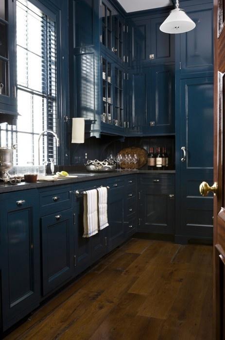
This kitchen below is similar, but a little more on the peacock end of the spectrum. I think dark wood floors are unexpected in the kitchen in newer construction, so this look could be easily recreated to add character and depth. Remember – the accents round out the look, so don’t overlook the hardware and light fixtures.
And again, one more in the peacock family for good measure. This one is interesting to me because it manages to incorporate the white trim in an unexpected way. Typically white doesn’t come across as uber-rich, but this room manages to defy the odds.

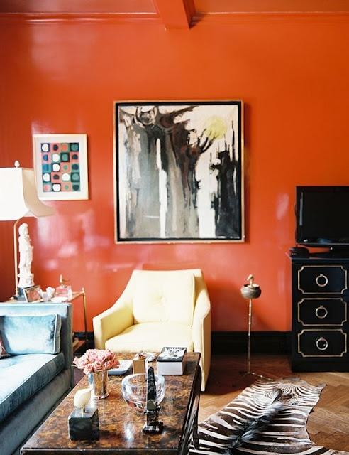
But I have to say that my favorite fall paint trend is insanely bold and chic orange. Yes, orange and brown were huge in the 70s, but an all new way to revitalize that tired look is with dark wood accents and lacquered accessories. Glamorous, dramatic, inviting.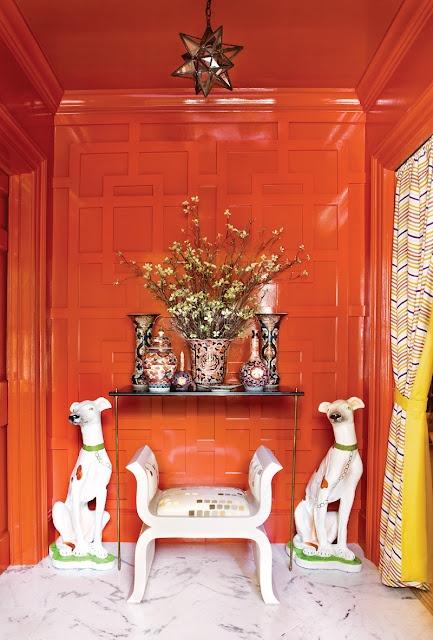
Doesn’t it feel like the perfect shade of pumpkin?

Finally, I included one bold ruby version because that lacquered wall is utter perfection. But I’ll be honest – truly great red rooms are kind of hard to find. This color is super tricky to work with and have it come across as chic. Remember what a big deal red rooms were in the 90s? I predict a resurgence, but you’ve got to be careful with what shade you go with. Look for something that skews a little more orange, like this one below. I’m in love with Benjamin Moore’s salsa right now.
Happy fall decorating – now I’m off to go research salsa red front doors!
You might also enjoy:
 A cozy wintry family room with Calico Corners Posted in Interiors, Portfolio
 Fall Decor Refresh with Bassett Furniture Posted in Interiors, Our House
 Pergo Big Reveal Posted in Interiors, Our House


