I got an email from the lovely folks at Benjamin Moore at the beginning of the summer, asking if I’d like to participate in their upcoming blogger campaign by using their Regal Select line. This was incredibly perfect timing and I said yes – that dining room was just begging for a fresh start. I’m definitely a fan of Benjamin Moore as I’ve used it extensively through our homes (the nursery, the studio, our lake house). I went with Lucerne AF-530 in Regal Select. It’s absolutely the best, hands down (and I’ve used a lot of different paint brands). Durable and perfect for high traffic areas (including the dining room). So today I’m going to give you a little sneak peek into my design process for this space, as well as the before shots (cue sad trombone).
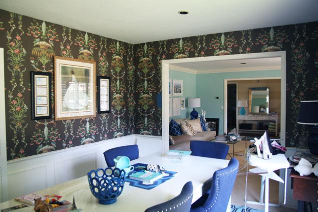
Sadly enough, the dining room has not seen much action beyond being The Room That I Shoot Photos In Sometimes as well as The Room That I Sometimes Iron In. Hardly the glamorous yet still approachable space I’ve been envisioning. I love love love my formal living room and the adjoining dining room has frankly been pretty sad for a long time.
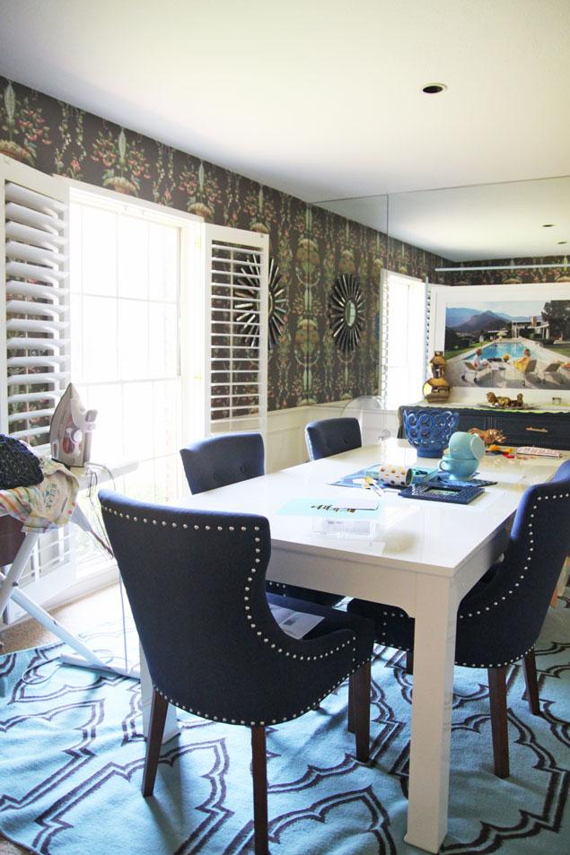
The thing is, it’s got great bones and some good pieces. I adore our lacquered dining room table from Jonathan Adler and navy upholstered chairs. And the pair of lucite chairs I got for my birthday a few years ago will also stay. But the rest all feels very mishmashy right now and undesigned, mostly due to my extreme distaste for that wallpaper (a point of contention for many people who come over – they LOVE that wallpaper!). There needs to be some cohesiveness with the drapes, the wall color, the accessories, the lighting — it’s all a mess right now.
And can we talk about how weird it is that there is no chandelier in here? This makes me so grumpy. Half the fun of a dining room is a showstopper chandelier. All we have are two finicky spotlights that sometimes go out if they get too hot.
So what’s the plan? First up, the wallpaper is a-comin’ down next week! I ordered my paint from Benjamin Moore (Lucerne AF-530) and I expect it to arrive shortly too. The painter will be knocking it all out, as well as wallpapering my entryway (just WAIT til I show you what the plan is!!!! Squee!!) and hopefully we’ll get our wood floors in before too long. Then once all the handyman work is done, I’ll get to styling the space.
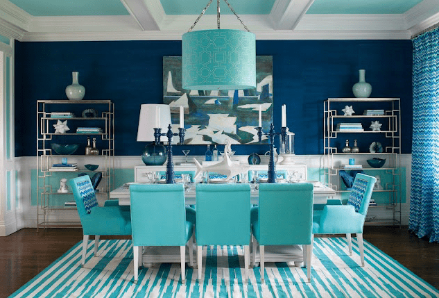
The ultimate inspiration for the dining room is this insanely fab dining room in a showhouse by Mabley Handler. I mean honestly. I die. That color scheme just rocks my socks off. I love how they used metallics to accent it, and that gigantic lamp on the buffet in the back is perfection.
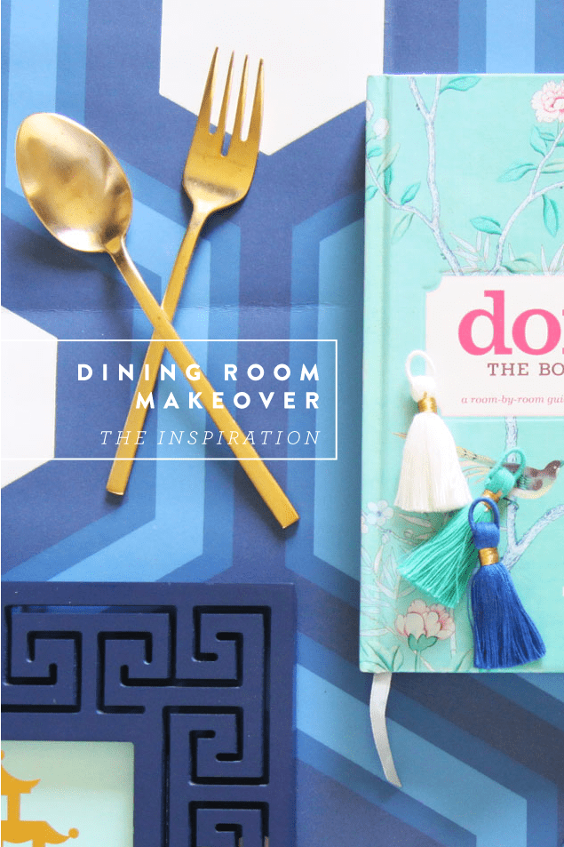
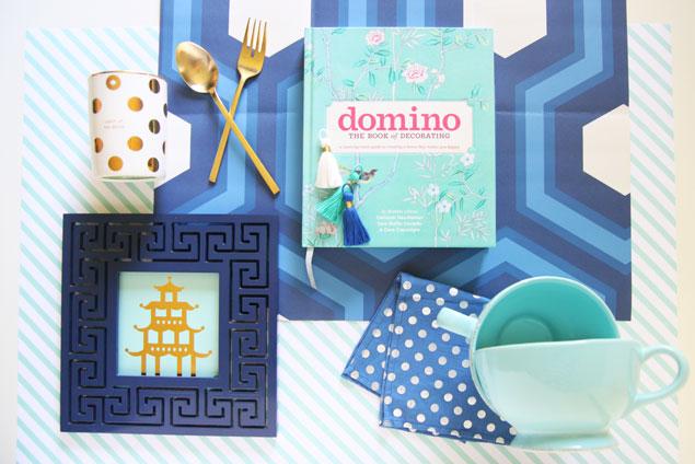
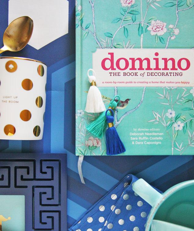
So I pulled together a few things to keep me visually inspired to keep the design of the room on track. Our space is considerably smaller, but since the formal living room sports a lovely aqua hue that will forever be my signature color, following through with navy and white in the dining room will tie it all together.
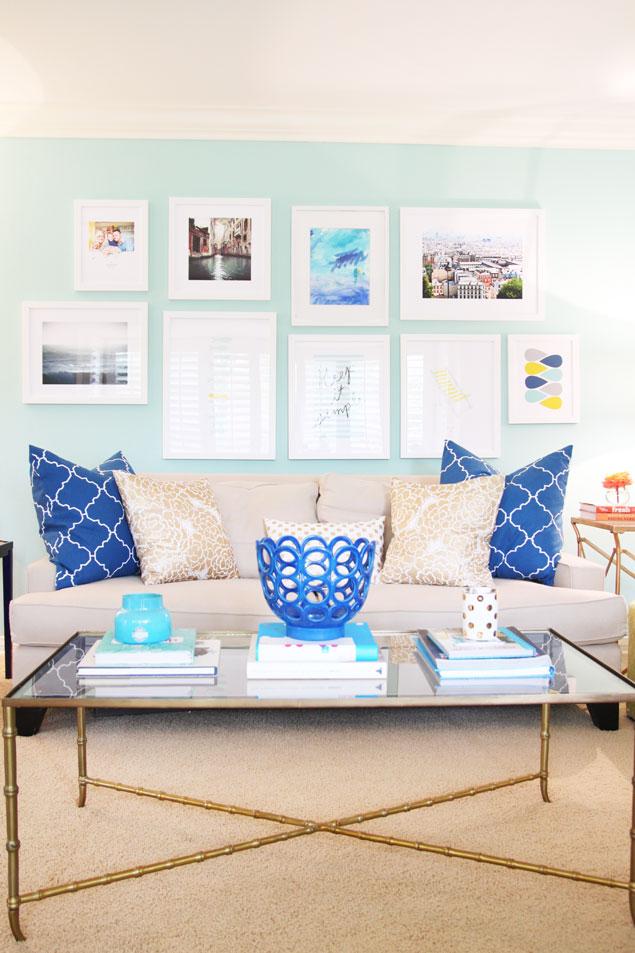
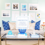
Remember, this is the living room:
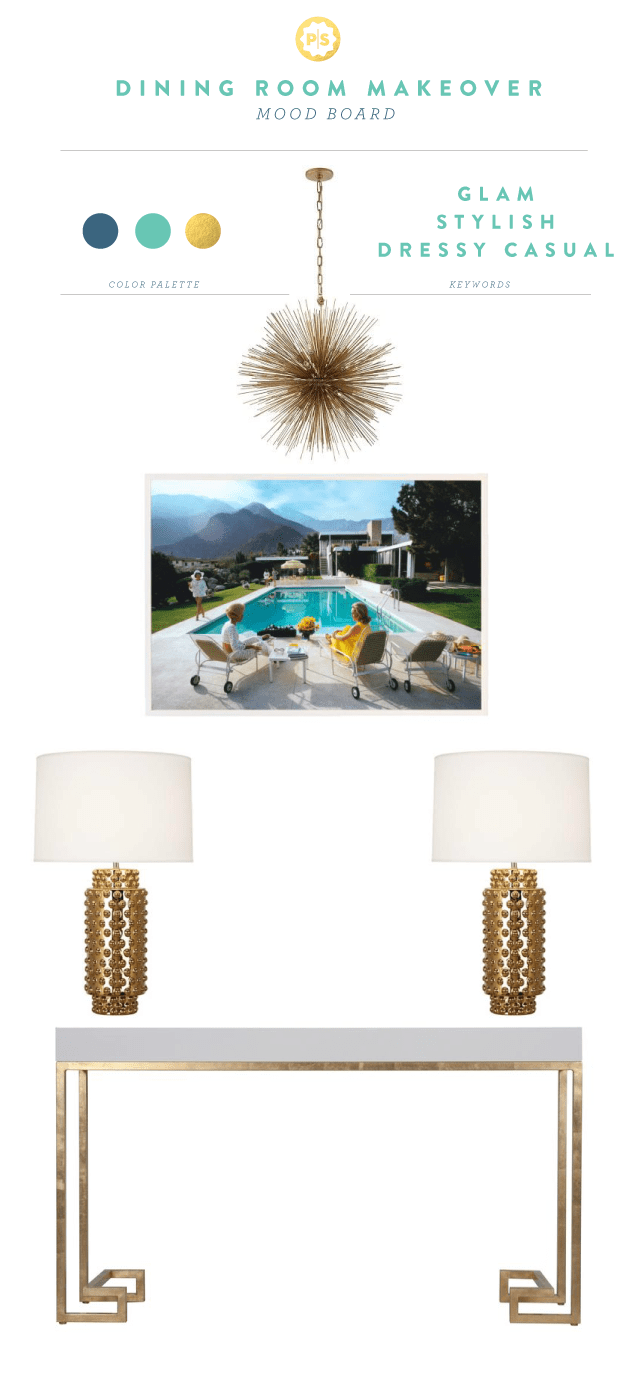
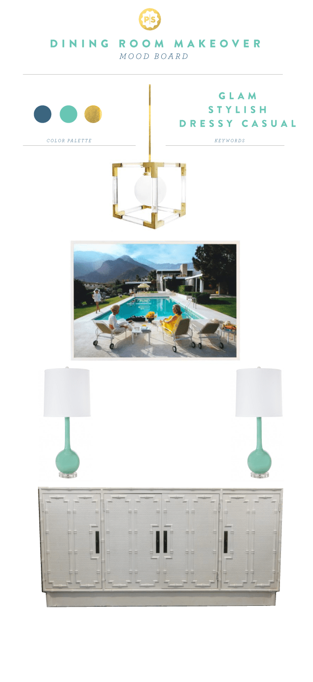
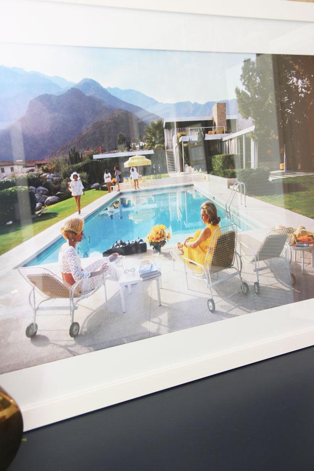
And here are a couple of mood boards I’ve pulled together too. The main thing is to create a visual focal point from the entryway, through the living room and into the dining room. I purchased this Slim Aarons photograph entitled Poolside Glamour and had it framed; this is what’s setting the emotional tone for the space. Quirky, stylish, casual but still glamorous.
Aren’t either of these chandeliers amazing? I think I really love styling consoles and buffets more than anything. So much potential for a major style statement. I really want there to be some Hollywood Regency element to the room, be it through a console or lighting.
I can’t wait to show you the big reveal soon!
