
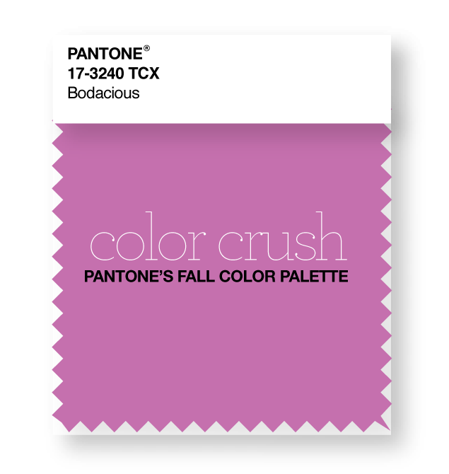
First, let’s all have a good snicker at the word “bodacious.” Because it’s hilarious & such a good name for a color. I’m sure you’re no stranger to Pantone’s color missives. This year, they released ten gorgeous colors that they’ve deemed the hot hues in fashion for fall 2016. But I wanted to see what they’d look like in interiors, so I teamed up with my friends at Ketch Design Centre to show off a handful of these hues for a new color crush series. (Thanks to Claire at Ketch for pulling these gorgeous samples for me!)
Ok, first up is this insanely fab color that Pantone calls Bodacious. Reminiscent of Radiant Orchid that was soooo big a few years ago, this color is gorgeous year-round.
Claire picked out a gorgeous Chinoiserie-themed wallpaper to set the tone for this whole look. It’s further proof that a single item can provide endless inspiration thanks to all the different colors and themes happening here. It could be chic in a dining room, fun in a girls’ bedroom, or an uber-fab powder bath.
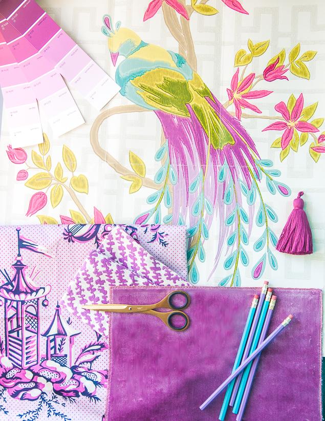
WALLPAPER: NINA CAMPBELL // FABRICS: ETRO VELVET // EILEEN KATHRYN BOYD FOR DURALEE (CAMERON IN HYACINTH) // BAILEY & GRIFFIN (SCENE CHINOISE IN AMETHYST)
GET THE LOOK: BODACIOUS

If you’re interested in any of these fabrics, contact Ketch and they’d be happy to help you out!
You might also enjoy:
 Color Crush: Spicy Mustard Posted in Color
 Color Crush: Pantone’s Riverside Blue Posted in Color
 Heavenly Honeysuckle Posted in Interiors


