

I know, I know. You’re thinking, what on earth else is she going to paint? I promise I’m done after this. I promise. It’s just that I keep thinking about our beautiful blue living room from the other house and, well, I miss it. I really do. It’s the only thing from that house that I miss, except maybe our beautiful hardwood floors. And since I can’t redo those floors, I can redo that blue. So I made Simon a deal: I have to have it 100% completed by next Wednesday – no touchups to finish, nothing. Completely finished.

Oh great, she’s at it again!
I’ve had paint chips up for awhile, and finally made a choice between 3 different Sherwin-Williams colors. None was just exactly right, so I took them back today for tweaking. None of these photos really do any of the colors justice. They look electric in these photos; not quite so dramatic in real life.


The trick is that I want it to blend with not only our dining room, but also the entry way, and as it leads into the bedroom. The entryway is the key: it blends the turquoise of our rug, as well as the deep green of our buffet. In the dining room, the wallpaper has all these colors and more, so it’s kind of the perfect bring-it-all-together pattern, in a way. But then there’s the matching green china cabinet to tie in the entryway as well. Finally, I found this photo as inspiration to link my blues and my greens from the living room into the master bedroom – not that I’d be using both colors together, moreso that it’s just a good visual reference for how the colors will look together.

So I finally went back and bought my gallon of paint, thinking that I’d landed on it. I got one wall totally painted, and then I ran out of tape for the rest of the room (grrr). Probably was all the better, though, because Simon didn’t like how bright it was, and to be fair, I wasn’t 100% sure of it either. I think I need it to be lighter.

And it’s just amazing to me, once again, how different it can look in different lights. Notice how on the left of that photo it looks greenish, but how in the shadows on the right, it has more of a blue cast? Amazing.
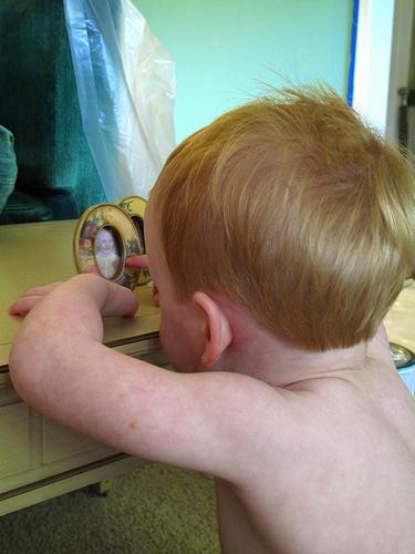
Painting with a toddler is torture. Just sayin’. But Sesame Street is the.best.

Should be interesting to see how the paint looks in the morning. Regardless, it’s going back to the paint store to be lightened significantly.

oklahoma city
carlton landing
interior

&
oklahoma
happy
design
Moody Blues
with love,
Rachel
make a coment


